10 Best Website Layout Ideas For 2026 To Keep Users Happy
Updated Dec 23, 2025 | Published Mar 12, 2025 | 11 min read
Updated Dec 23, 2025 | Published Mar 12, 2025 | 11 min read

A great website is about creating a smooth and enjoyable experience for your visitors. The right website layout is key to maintaining engagement, as it shapes how people interact with your content and keeps them interested.
Fortunately, the days of needing extensive coding knowledge or web design expertise to create a great site are mostly over. Today, you can choose from templates and design elements that make it easy to build a website that matches your vision.
A website layout is like arranging furniture in a store; imagine walking into a shop and first noticing the big “SALE” sign (because it’s large and red). Then, your eyes move to the featured products on the main display and minor details like price tags and product descriptions.
In web design, this natural flow of attention from the most prominent to the least prominent elements is known as the visual hierarchy. For a good example, look at Amazon’s product pages. At the top, you’ll see a large product image that grabs your attention first. Next to that is the product title and price in bold, which holds your focus next.
Below that is the bright-colored “Buy Now” button. Finally, the detailed product description and reviews are in smaller text, typically the last thing you look at. Although the information may all appear random, a carefully planned visual hierarchy guides you through it in order of importance.
Think of your website layout as a physical shop but in a digital format. Now, imagine walking into two different stores. In the first store, everything is scattered randomly; the shoes are mixed with groceries, the checkout counter is hidden in a corner, and sale signs are everywhere. You would find the whole thing confusing and walk out without buying anything.
The second store sells similar items, but everything is grouped. There is clear signage, and you can easily find your way to the checkout. That’s what a good website layout does and something you must consider if you decide to start an online store.
A well-designed website layout matters because:
Every site layout type has advantages, and selecting the right one can dramatically impact visitors’ interactions with your site.
These layouts tell your brand’s story and showcase your products or services. The right structure for you will depend on what type of website you have. Choosing the ideal layout design for your website isn’t only about what looks good; it’s about understanding how people will naturally interact with it.
Let’s explore popular website layout ideas, each designed to suit different needs, whether you’re sharing information, showcasing your work, or building an online portfolio.
Imagine how it feels to read a magazine and what happens to your eyes as you look over a page. Your eyes naturally move from the top left corner across to the right, then diagonally down to the left and across to the right again, forming a ‘Z’ shape.
That’s precisely what a Z-pattern layout does on your website: it creates visual clues that form a natural pattern for people’s eyes to follow. This layout works best when you have a simple message to share.
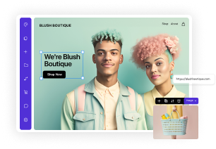
For example, an ecommerce store might use this layout to direct attention from a featured product image to a promotional message, then down to a “Shop Now” button.
Have you ever noticed how you read a newspaper? You scan across the headlines at the top, then down the left side, looking for interesting bits, occasionally reading across for more details. This website layout is called an F pattern and works well for content-heavy websites.
It works like a grocery store, with signs above each aisle and a list of the contents along the side. The F-shaped layout helps people quickly find what they’re looking for without reading everything on your site. It means putting your main message at the top, important navigation on the left, and detailed content across the page.
For creative websites looking to break away from standard layout ideas, the zig-zag pattern offers a dynamic way to present your site’s content while maintaining visual hierarchy. This layout creates a natural flow that keeps visitors engaged as they scroll, alternating between text and images or different content blocks.
It’s a good choice for ecommerce websites if you want to tell stories about your products or maybe an art portfolio site. Imagine a picture on the left, text on the right, another image on the left, and so on, creating a natural flow that keeps people interested.
A modular grid layout helps organize content effectively, especially for portfolio sites that want to showcase multiple images with proper visual weight. Grid layouts offer tremendous flexibility while maintaining a clean, organized appearance that site visitors appreciate.
Everything is neatly arranged in rows and columns, making it easy to browse images quickly. It’s the digital equivalent of a department store’s display wall: clean, organized, and easy to scan.
This layout is perfect for different business ideas that showcase many products because it gives each item a dedicated display case. Visitors can quickly skim everything you offer, just like scanning a catalog. Whether you or someone else manages your website, this structure keeps it organized and easy to update.
This layout features a fixed sidebar alongside the main content areas. It is perfect for important pages that need to balance information with a stronger visual force. Two-column designs are particularly effective for pages that show large images alongside detailed descriptions.
On your website, this might mean having product images on one side and all the essential details (price, description, ‘buy’ button) on the other. This layout design is clean and organized and helps people find information quickly.
Card-based designs excel at presenting bite-sized content while maintaining sound and highly visual elements across all devices. Each card acts as a self-contained unit of information, making them perfect for product catalogs and category pages.
Think of cards as little digital product displays, similar to how a jewelry store might arrange different pieces in separate display cases. Each card contains everything a customer needs to know about one product: an image, a short description, a price, and a ‘buy’ button.
This layout could be great for your online family business. It organizes everything and makes browsing easy, like flipping through a deck of cards. It works well for sites with many products.
Using a full-screen photo creates an immediate impact, and this approach works particularly well for long-form articles or premium product showcases. Full-screen layouts immerse visitors in your brand experience and can be particularly effective for luxury or lifestyle products.
It’s bold, attention-grabbing, and perfect for making a strong first impression. Minimal text and subtle navigation elements keep the focus on your visuals while making it easy for visitors to explore further.
If you want to make an impactful first impression, you need a hero layout or hero section with a strong-featured image layout and a clear focal point. This style immediately communicates your brand and guides visitors toward your main goals.
For example, you might feature your latest collection with a striking hero image, add an attention-grabbing headline, and include a clickable button with a defined CTA.
Consider the magazine layout if you have a wide variety of content to share and want to present it in a visually dynamic way. This exciting style mixes different-sized content blocks and varies the size and placement of small and large images, headlines, and text blocks to create high visual interest.
Whether you’re an artist, writer, or have a side hustle, this layout allows you to showcase multiple features simultaneously without overwhelming your visitors. You can also make certain elements more prominent while maintaining a natural flow throughout the webpage.
An asymmetrical layout breaks traditional grid patterns to create a more potent visual force while maintaining professional polish. This more modern approach can make your website design stand out while maintaining usability and clear navigation paths.
A successful asymmetrical design is all about creating controlled contrast. While the elements might not mirror each other perfectly, they must balance each other out. Use this layout style to make your web pages memorable and unique while maintaining a professional look.
Browse through Friday’s website templates.
The split-screen layout divides your content into clear sections and is ideal for websites that want to present distinct categories, such as portfolio sites and category pages.
Each web page focuses on different aspects of your brand or product categories, making for a user-friendly site. The versatile layout allows you to use varied imagery, contrasting colors, and various content types while maintaining the overall look of your website.
A single-column layout provides clarity and focus, which is especially valuable when creating a landing page on mobile business websites. Despite its simplicity, it is incredibly effective at eliminating distractions and guiding visitors in a controlled and intentional manner.
The vertical column layout is a great starting point if you’re learning how to make a business website. This versatile layout allows your website’s content to adapt perfectly across devices while leaving positive feedback. Another great feature is that you can create natural breaks in the content to help pace the information.
Designing a website might seem tricky at first, especially if you are new to it, but don’t worry, it’s easier than you think! These five simple tips will help you create a great layout that makes sense and keeps visitors happy.
Choosing your website or online store layout can feel overwhelming. Hence, a good place to start is to consider how you want to balance the aesthetic appeal of your design with practical functionality. Whether you opt for a z-pattern, split screen, or one-column layout, remember that the best layouts serve your target audience while meeting your business goals.
Success in websites comes from understanding how visual, design, and web page elements work together to create a compelling user experience. Applying these common layout ideas and focusing on visitors’ needs will make your website’s structure look professional while delivering results.