The 10 Best Architecture Websites of 2024

By Stefani Anderson
Updated: Feb 09, 2024
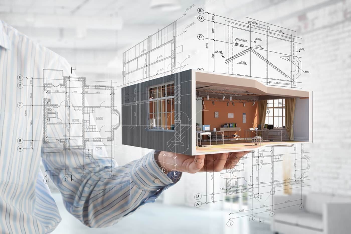
Featuring stunning photographs and clean user interfaces, the best architecture websites demonstrate the importance of eye-catching design.
Architecture firms are often at the cutting edge of style and technology, reflected in their approach to delivering a solid online presence.
In this article, we'll break down the design choices and interactive elements that help make these stunning architecture websites work so well.
The 10 Best Architecture Websites of 2024
Creating a great website requires a combination of eye-catching aesthetics and a smooth user experience that presents information with precision.
We've selected a variety of architecture websites that capture these requirements, from small-scale custom residencies to large urban projects.
So, with our criteria explained, here's our list of the best architecture websites of 2024:
10. A&A
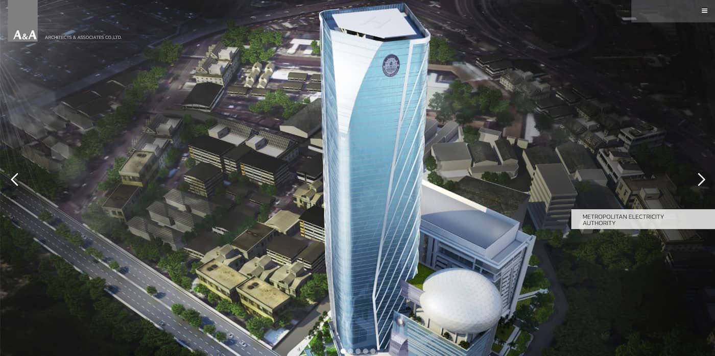
Established in 1990, professional architecture company A&A has worked on a range of major buildings and construction projects worldwide.
Their website instantly captures the grand scale of these projects, presenting visitors with a slideshow of high-rise buildings captured in stunning photographs.
After attracting potential clients with this visual display, the architecture website presents a menu leading to basic information about the company.
Additional information about the experience and work ethos of the management team adds context to the process used by the designers.
There's also a section dedicated to each project type, covering everything from apartments and hotels to large commercial and housing projects.
Each section details their architectural accomplishments with large images showing the projects in their built environment, with data on cost and location.
It's a comprehensive overview of A&A's proven performance in delivering strong architectural services for their clients with a modern sensibility.
As with the best consulting websites, this architecture website showcases the level of design that can be achieved when creating professional content.
9. Bunker Arquitectura
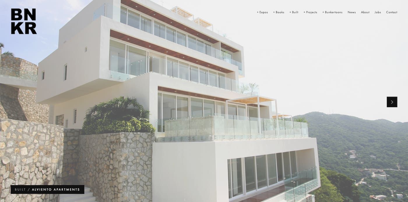
The designers at Bunker Arquitectura have a forward-thinking approach to architecture that is evident from the moment the home page loads.
As with A&A, they've opted to push their most striking projects to the forefront with a carousel of high-quality photographs of their buildings.
These projects are all covered in detail in the relevant subcategory, with each featuring drawings, 3D mockups, and information on the site and landscape.
Completed projects are listed separately, showing the breadth of the company's experience building striking structures and interiors.
Their architecture website is an inspiration for anyone interested in what can be achieved with a website builder to deliver great results.
Built on a white backdrop, it lists the various categories in neat black text while retaining the majority of the space for vibrant images.
Bunker Arquitectura brings a great deal of value proposition to readers, with extensive resources on their projects and other reading material.
You can access their books through the site, and there's even a comic strip along with the standard New, About, and Contact page options.
Like other impressive architecture websites, Bunker Arquitectura demonstrates the importance of aesthetically rich presentation to keep visitors on the site.
8. Herzog & de Meuron
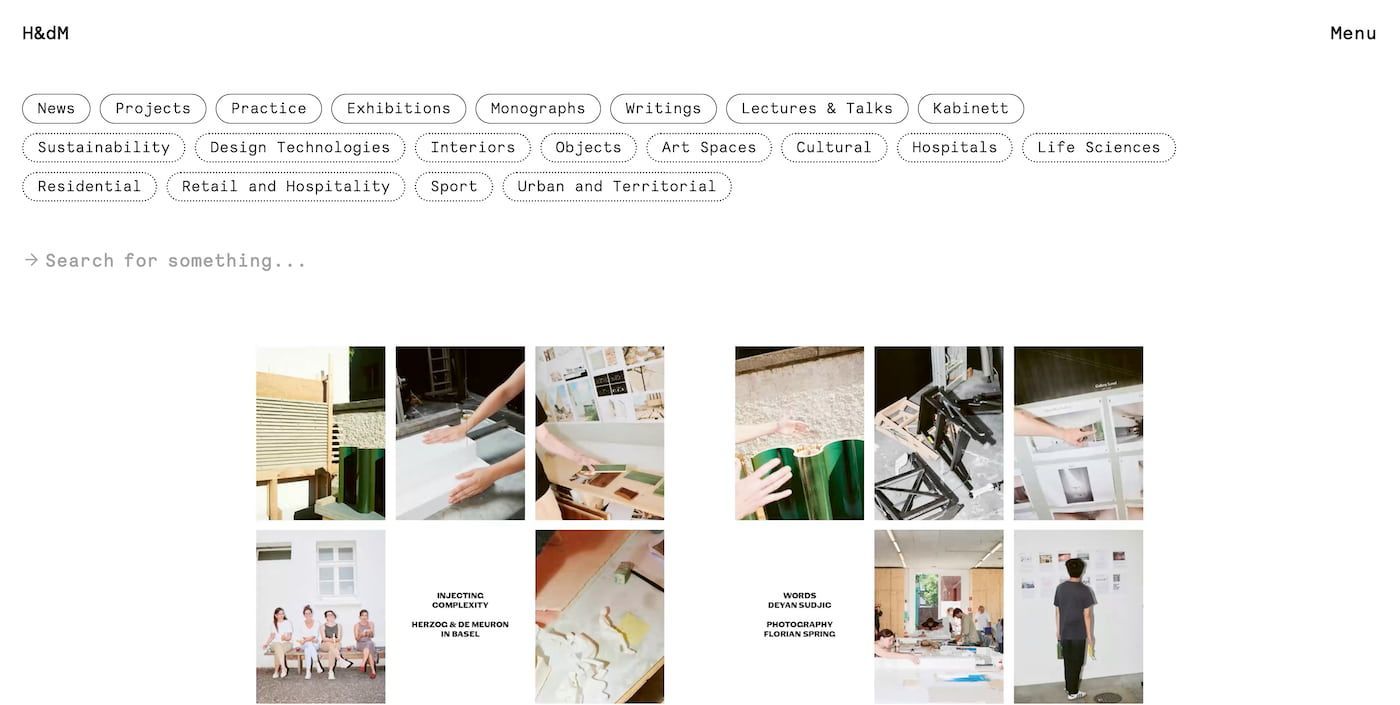
While the previous architecture websites have used dominant images to capture the reader's attention, Herzog & de Meuron opted for a different approach.
Their architecture website retains the dominant white background used by Bunker Arquitectura but instead punctuates this with lots of information.
The website features links to all of its subcategories at the top of the screen, with an additional menu link in the top right-hand corner.
While initially overwhelming, this instantly gives the visitor access to all the website's content, whether looking for interiors or residential projects.
The architecture firm, regarded as masters of their field, features a text breakdown of the guiding principles behind each project.
This creates a sense of community, bringing visitors closer to the company's history and the goals they're focused on achieving.
Additional resources on their architecture website covering lectures and talks give further insights into their development process.
The result is an in-depth overview of their brand, covering all aspects of the design and construction from architects at the top of their game.
7. Effekt
Successful branding is all about selecting a business name idea that captures the spirit of your company as concisely as possible.
Our next architecture website accomplishes this effectively, combining a catchy name with equally stimulating on-screen visuals.
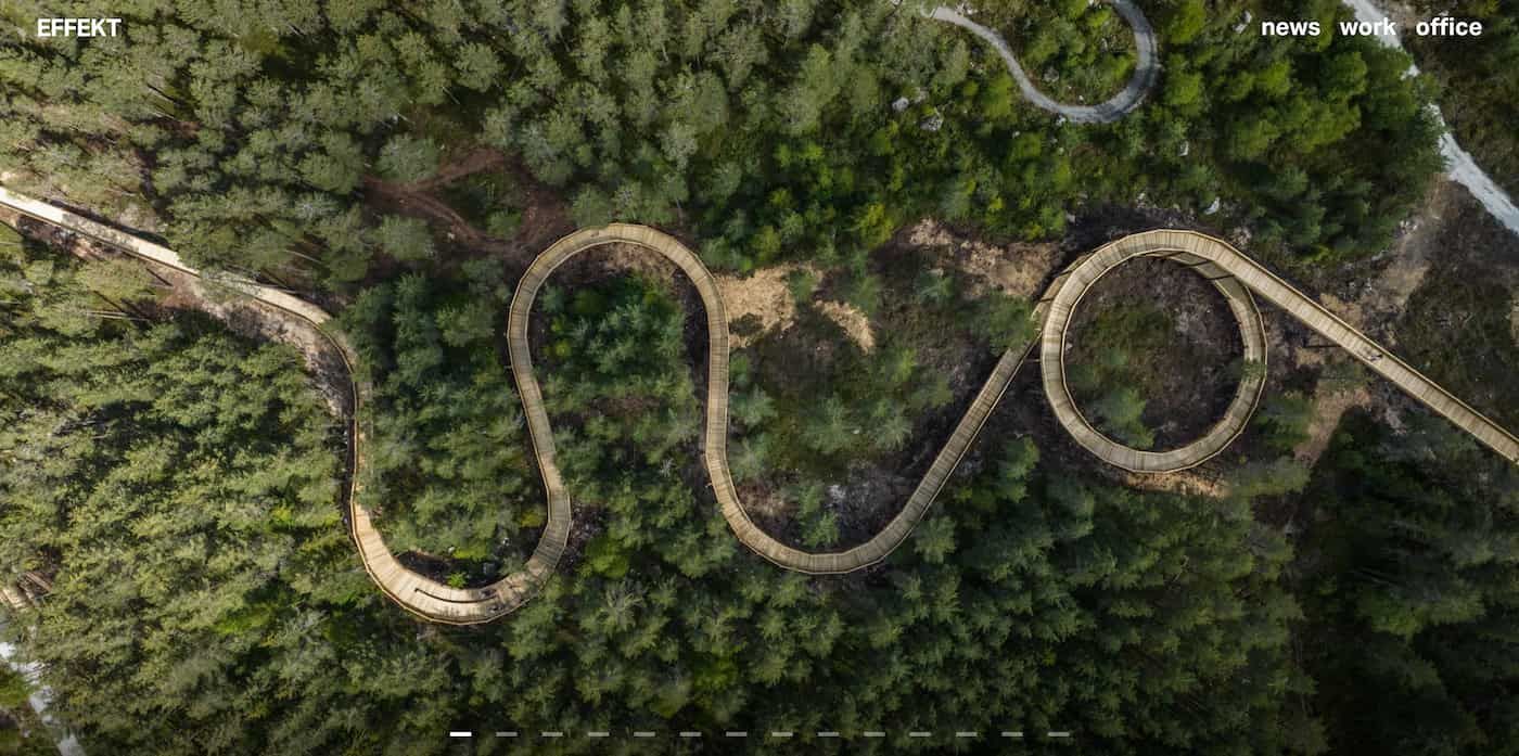
The design studio Effekt, based in Copenhagen, Denmark, is focused on projects that integrate structures with their natural surrounding systems.
Whether working on landscape architecture projects or urban planning, there's a concerted effort to adopt a holistic approach to meeting sustainability goals.
Images of their projects in natural environments help to cement these priorities when their architecture website opens and carries through their examples of work.
The site's structure keeps things simple with three main menu options: News, Work, and Office, each leading to various subcategories.
Head over to the Office category, and you'll find the bulk of the website's resources and the option to contact the company.
There are also sections exploring their podcasts and events, as well as an overview of the awards and publications they've worked on.
Featuring a clean layout, optimal search function, and overall intuitive design, it delivers plenty of food for thought for anyone creating a website.
6. SOM
Architecture firms are among the best international business ideas, working on projects that adapt to the demands expected from each location.
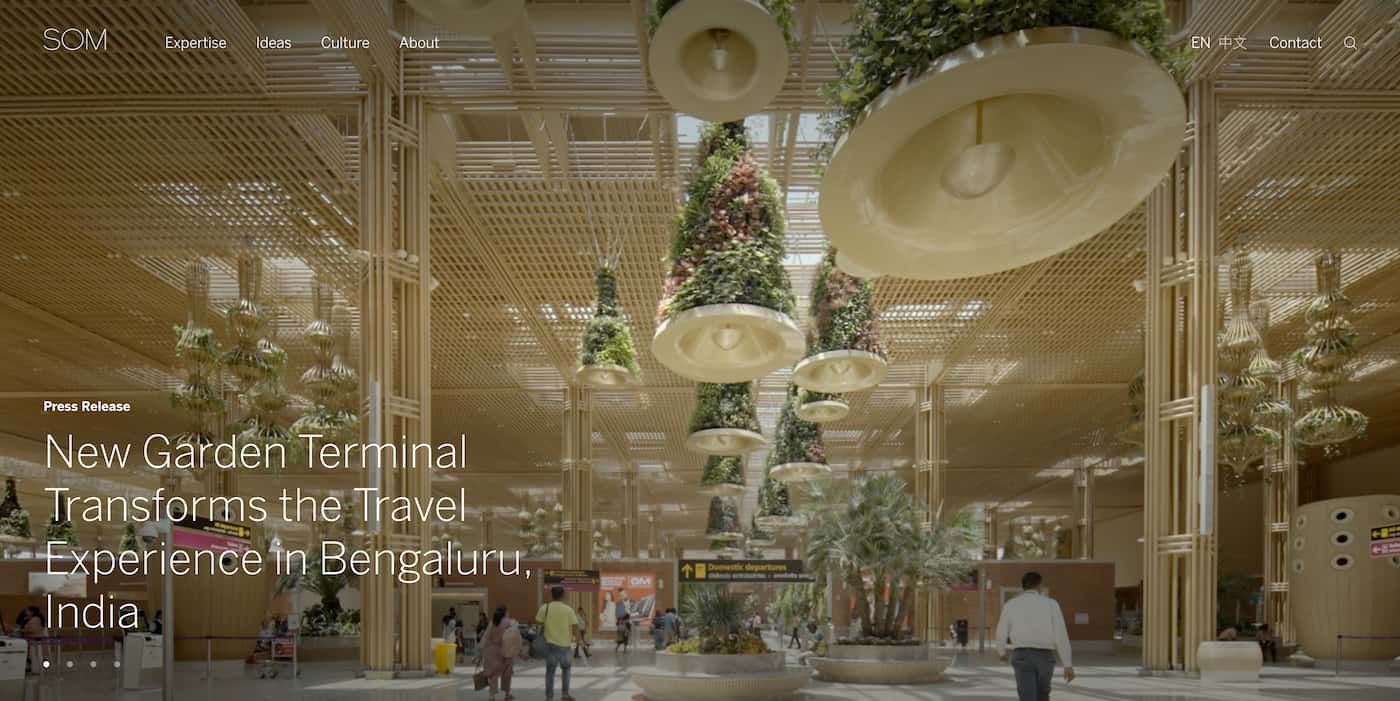
The architecture website for SOM exemplifies this international scope through a series of project overviews that highlight their innovation.
While some architecture websites use images to showcase their work, SOM's opening screen delivers stunning video footage of their skyscrapers.
Shot during magic hour, these clips bring to life the sunlight reflecting off glass and the interior spaces that capture their use of space.
Follow the links on the website's menu, and readers can access additional information about their expertise as world-class architects on the cutting edge.
Additionally, there are pages dedicated to exploring the company's work culture and commitment to DEI and the people who work there.
The site also dives into the details of their services and project history, covering the breadth of structures they've worked on over the years.
A section covering graphics and branding is an excellent reference for anyone building their personal website and learning about visual communication.
It's another excellent example of how to create a visually appealing website by integrating a variety of media into the core platform.
5. Felicity Christian
New Zealand-based architect Felicity Christian shifted the emphasis away from large-scale urban projects and focused on high-end residential properties.
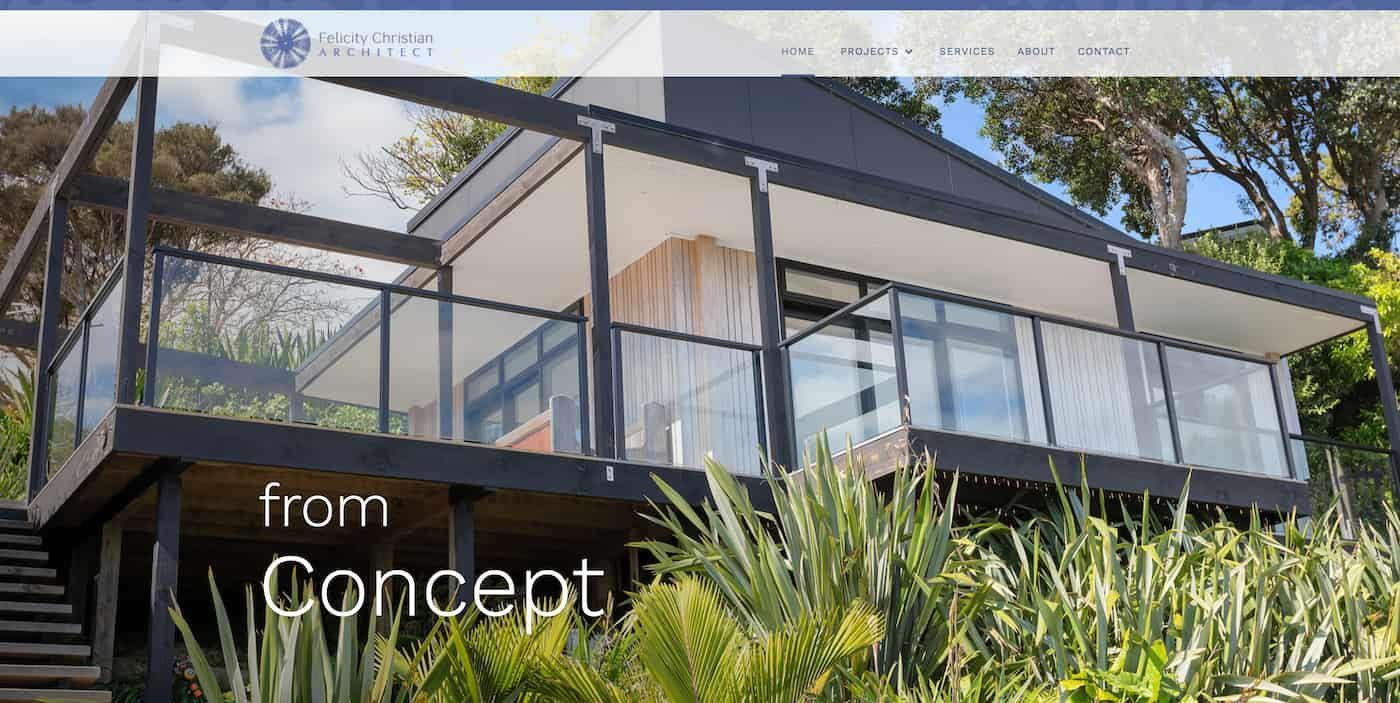
The designers use glass, space, and light to great effect, setting their homes against a backdrop of nature and plant life.
A stunning example of this approach is presented on the home page in large images, with a simple menu at the top of the screen.
This includes a Contact and About page exploring their background and a link to subcategories where readers can learn about their project archives.
Felicity Christian has won small project awards for their architecture, and this prestigious level of design is captured in the many photos on their website.
The award-winning structure's design and construction process is outlined in detail, from early drawings to the technology used to build it.
For more information on their services and design ethos, the website has a separate section to explore the step-by-step process.
Writing is concise and engaging throughout their architecture website and offers real value for those interested in partnering with the firm.
With animated elements that enhance the interactive experience, the Felicity Christian website delivers plenty of ideas for web designers.
4. Blackbox Architectonics
Some of the best architecture websites take advantage of light and color to create a strong first impression and capture the reader's attention.
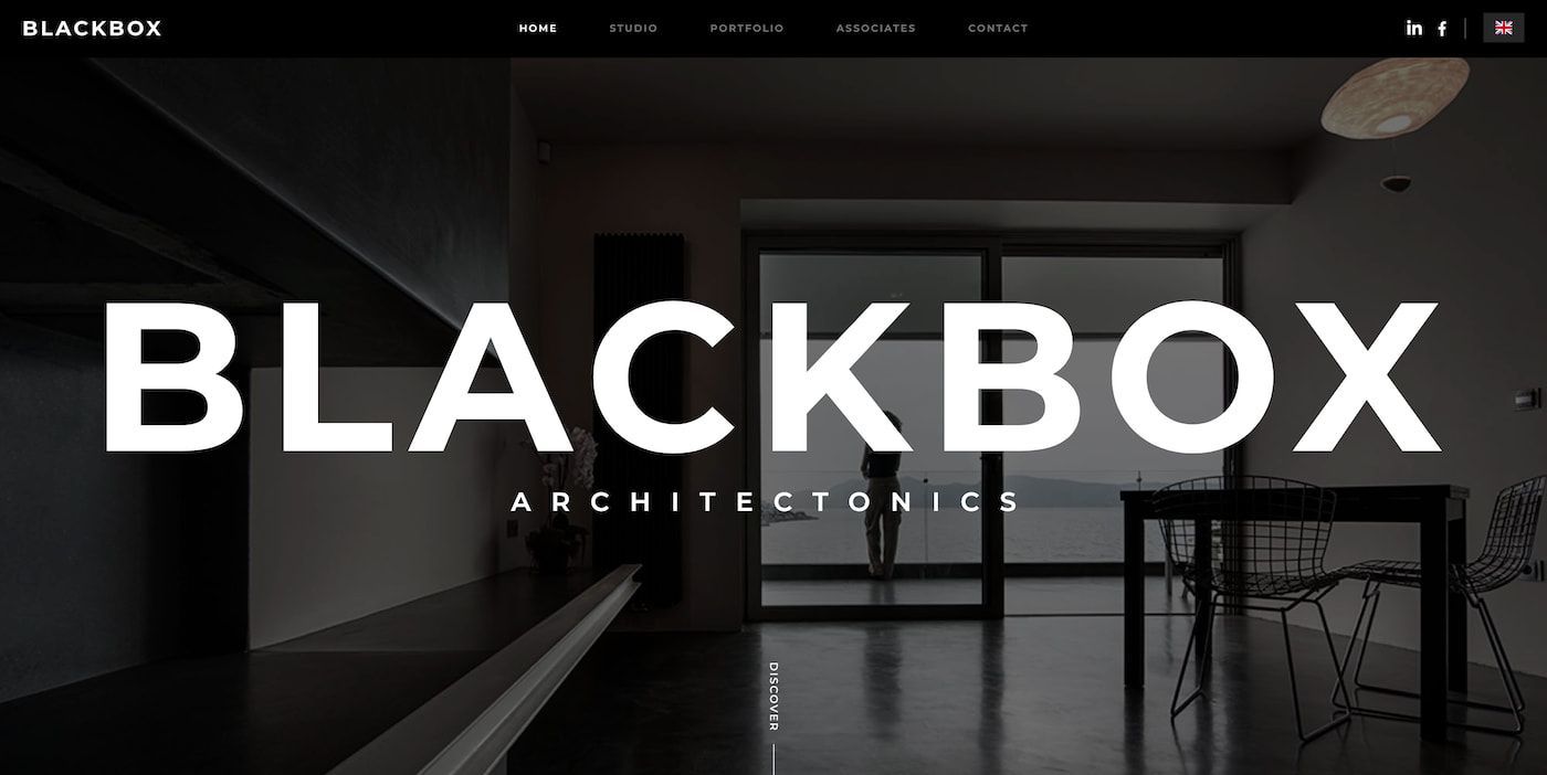
The architecture website for Blackbox Architectonics takes a different approach, with a high-contrast, black-and-white image combined with subtle motion.
By taking this approach, the Blackbox Architectonics logo instantly pops off the screen with its bright white font, capturing the site's minimalist aesthetic.
If you're learning how to design a logo, Blackbox Architectonics' design is an excellent example of how to use a clean and bold approach.
Scroll down from the image and the site presents a series of thumbnail links to their planning, design, and project consulting services.
Set against a gray and white background, these links also include short text introducing the content, with new projects listed in order.
Professional photographs for each project highlight the form and function of the buildings, with project galleries covering them from multiple angles.
Architects who visit the site for more information on collaborations can read through the company's policy on working with associates on projects.
This includes a handy contact form where they can request a meeting with the team and apply to partner with them on upcoming projects.
3. PROCAD Designs
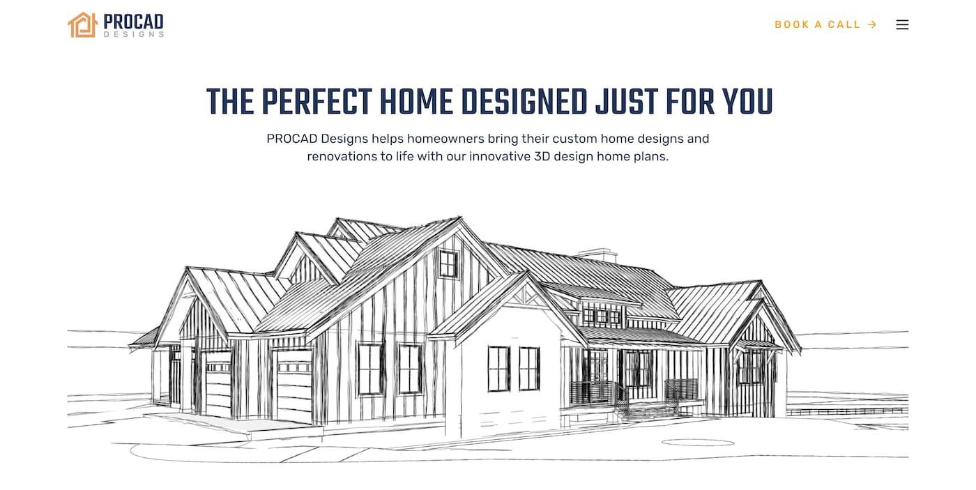
Many of the leading architecture websites cover contemporary designs with a modern twist, but PROCAD Designs bucks this trend with traditional buildings.
Their residential properties for clients based in Canada are renowned for their reference to classic architectural styles using the latest technology.
The website presents their commitment to custom designs for homeowners on the home page, with an illustration of one of their unique homes.
Additional media on the home page, including videos and animated images, presents more information highlighting their previous custom projects.
There's a wealth of information on current and past projects to explore, as well as a blog outlining their approach to energy efficiency and other topics.
PROCAD Designs has also emphasized its eagerness to reach out to potential clients with a link to booking a call featured throughout the website.
Clients can also log onto their account and keep track of their projects, follow up on developments, and speak to a member of the firm.
It's a solid example of how architecture websites can showcase work while delivering an intuitive, stress-free user experience.
If you're a solopreneur or an entrepreneur building your online presence, the PROCAD Designs website offers plenty of food for thought.
2. Largo Studio
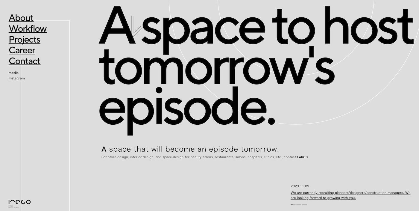
Japanese architecture firm Largo Studio strips things back to the drawing board in a literal sense with its exceptionally minimalistic design.
Combined with gray and white animated elements with black text, it's an impressive visual experience that encapsulates the precision of architecture.
Each time the user clicks on a link, text and geometric shapes are animated on and off the screen to create a great sense of interaction.
The overall minimalist approach is continued throughout the architecture website, with bullet points breaking the text into readable sections.
Largo Studio has a large selection of past work, with each thumbnail accompanied by category, location, and total area information.
Their approach to categorization is unique, including categories such as beauty, as opposed to the standard building types used by other architecture websites.
Photographs showcase the style used for each project, while visitors can head over to their Instagram account for more visual assets.
Largo Studio uses animation combined with concise text to great effect, highlighting how web development can be applied in versatile ways.
1. Ark Shelter
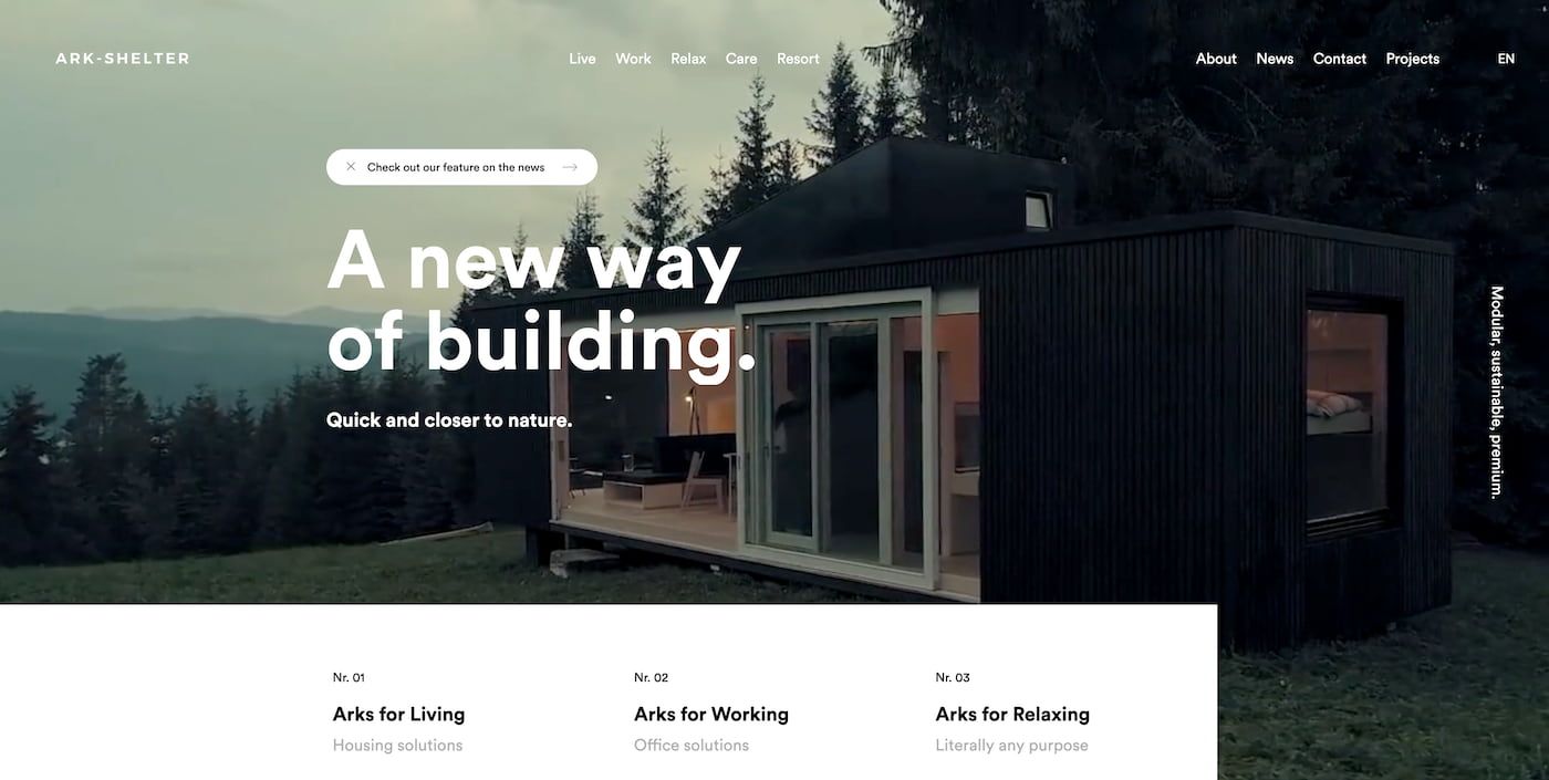
Our final pick showcasing the best architecture websites comes from Ark Shelter, a new innovator focusing on modular structures.
Committed to sustainable construction and recycling, their buildings use materials such as shipping containers and upscale them for modern living.
As such, the site emphasizes this combination of architecture and lifestyle, with categories dedicated to relaxing, care, and resort projects.
It's another strong example of how an eye-catching website combines mixed media with photographs accompanied by full-screen videos.
The videos use various techniques, including drone footage and snappy transitions, and perfectly capture the sense of space and location.
This visual approach also carries through to the standard content, such as the About and Contact pages, each with rich visuals on display.
A great example of the value of a website builder, Ark Shelter's site shows what can be accomplished with the tools and technology.
Summary
Many approaches can be used to build a striking online presence, and this list of architecture websites highlights the potential results.
Bringing together strong visuals that capture their work and intuitive layouts for ease of use, they offer plenty of ideas for website creators to use.
Whether setting up a personal website or updating your company's digital assets, these sites showcase the core design principles to follow.
CREATE YOUR OWN WEBSITE
As a mom of three, writing became Stefani’s creative outlet, quickly evolving into a part-time side hustle she could do during nap time. After realizing, she had a knack for writing, Stefani pursued it as a profession and now heads up Friday's content. When she's not wordsmithing for Friday, Stefani enjoys playing at the park with her family, snowboarding, and trying new food.
This blog was created proudly with the Friday Website Builder


