The 25 Best Consulting Website Examples To Inspire Your Own

By Stefani Anderson
Updated: Jan 16, 2024

The best consulting websites offer many insights into how a successful business combines visual assets with information to attract new clients.
Whether you're offering consulting services for startups or setting up a web design agency, these websites are essential references.
This article covers consulting websites for all types of businesses, showcasing the best use of illustrations, text, and fonts to capture attention.
The 25 Best Consulting Website Examples In 2024
A well-designed consulting website builds trust with the visitor by showcasing the company's successful projects and professional approach.
We've selected a broad spectrum of consulting website examples to help your web design strategy deliver the best outcomes for your business.
So, with that said, here's our list of the 25 best consulting websites for 2024:
25. Current Advisory
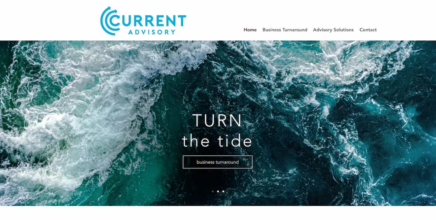
Current Advisory's professional consulting business is oriented toward helping other companies achieve their business goals.
Some of their services include dealing with customers and suppliers, effectively managing cash flow, and meeting requirements set by the government.
Their consulting website lays out these services clearly and concisely, with the key information and contact details all displayed on the home page.
It uses a clean combination of design elements and fonts, with vibrant images on a carousel to draw the reader into the content.
If you're setting up a service business idea, Current Advisory's consulting website is a visually appealing reference point worth bookmarking.
24. Prophet
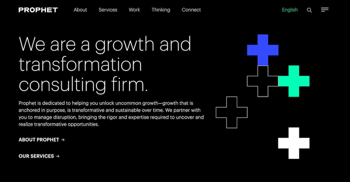
Like Current Advisory, the consulting firm Prophet uses a striking combination of concise text and bold imagery to attract potential clients.
Taking a leaf from the Big Four consulting firms, it backs up its informative text with attractive photographs and branding elements.
In addition to detailed information about their services, the Prophet consulting website also includes an in-depth blog offering industry insights.
This makes it a great website for potential clients who want to take advantage of resources to help drive business growth and transformation.
You can also use this as a point of reference if you're setting up a blog website builder to share insights your potential clients might appreciate.
It's an easily accessible platform incorporating clear social media icons and a bold design approach for visitors.
23. Plan London
Setting up a business website offering strategy consultancy is one of the best solopreneur business ideas you can start from home.
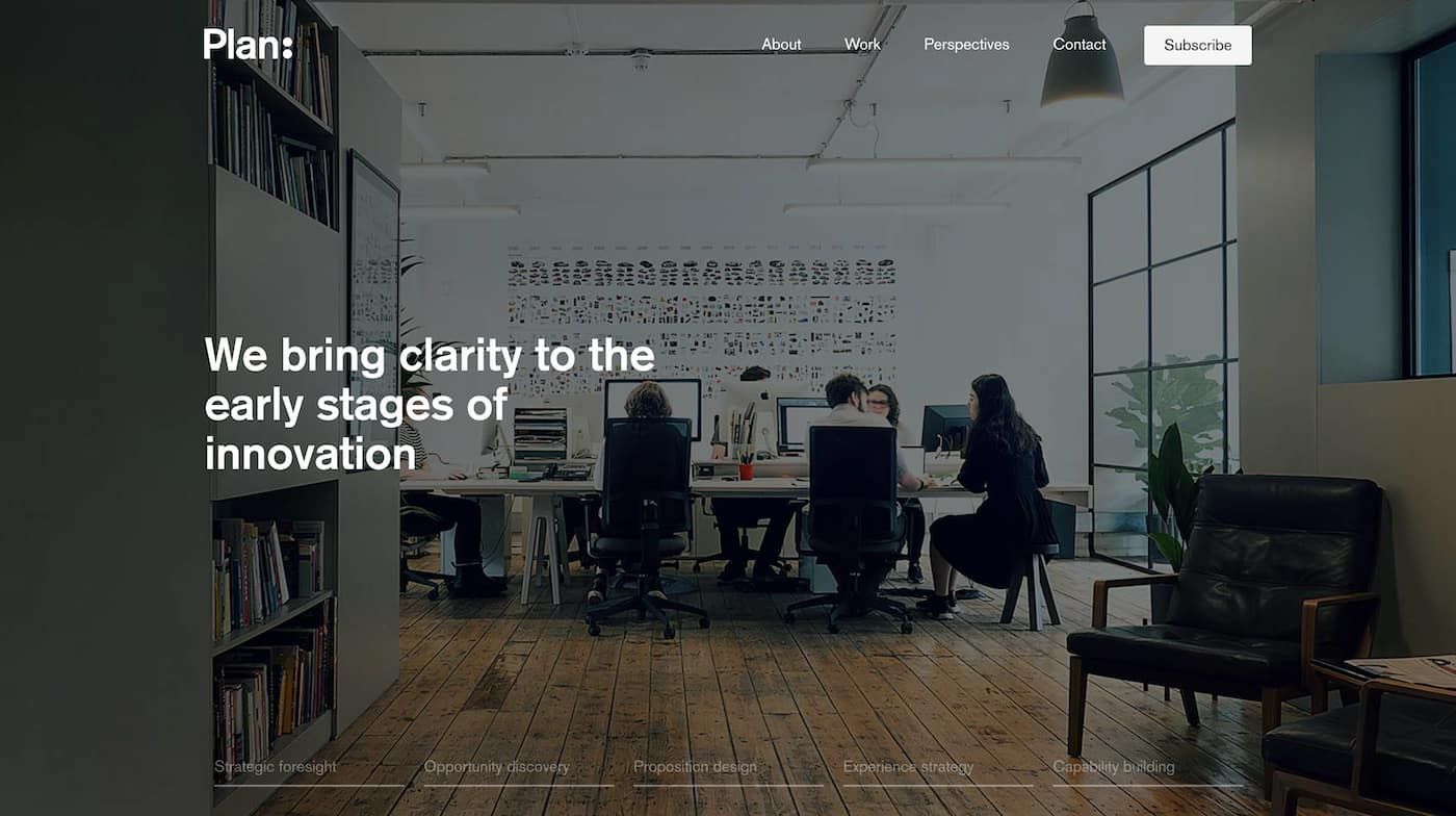
The consulting website for Plan London captures the essence of how top consultant websites showcase their services in the best light.
The site's home page covers all the core information expected from potential clients, from their work history to examples of satisfied clients.
Head over to the Work page, and Plan London's consulting website breaks down their core services in detailed breakdowns with examples.
Additional substance is offered on their Perspectives page, where visitors can read articles from market leaders on a range of topics.
22. The Bruin Group
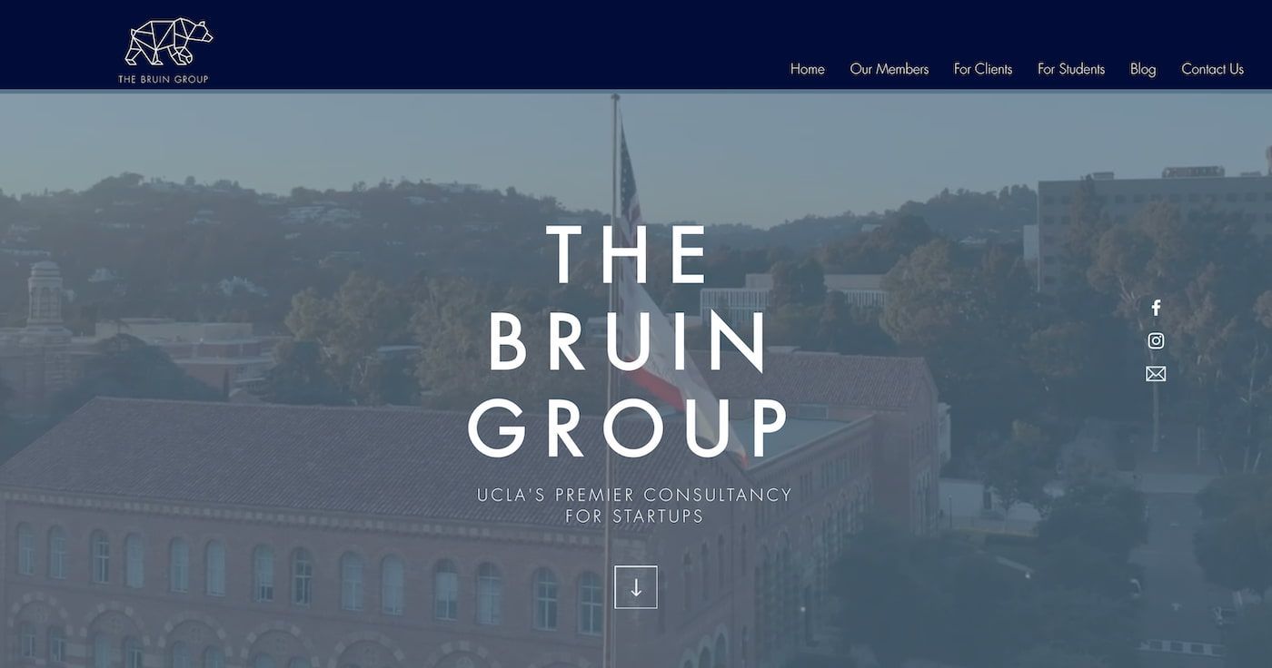
The Bruin Group, established to assist startups with creating innovative solutions, is a stunning example of a consulting website design done right.
Home page fonts are minimalist and set against a video background before presenting a list of established clients that offer social proof.
The Bruin Group consulting website also includes everything clients can expect when using online services.
This includes identifying the client's needs, creating a plan, and offering extensive research and analysis services to deliver results.
It's a professional consulting website that showcases what can be accomplished with website templates to market your services.
21. Jeremy Malcolm
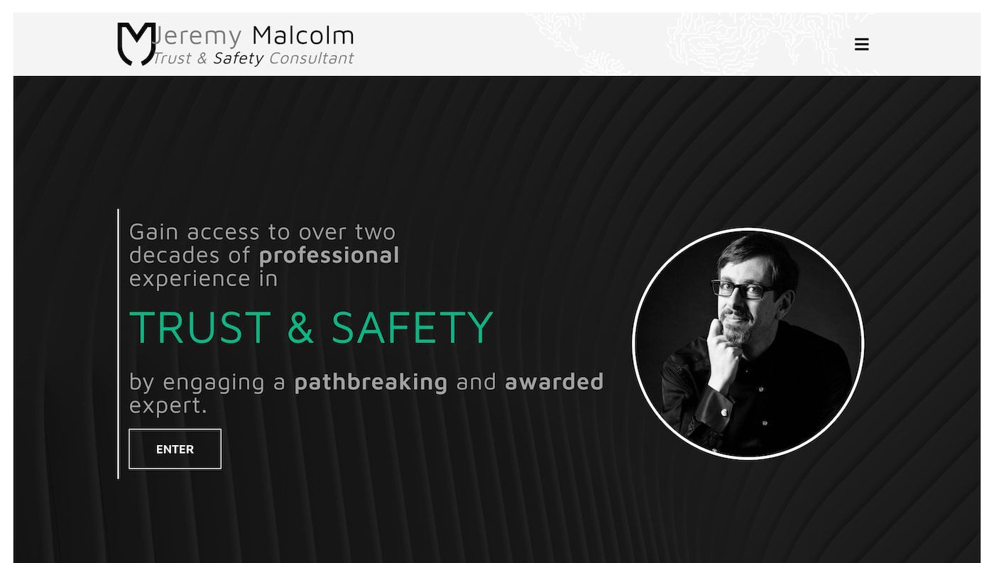
Many good consulting websites utilize animations, text, and graphic design elements to attract potential customers.
The consulting website for Jeremy Malcolm is an excellent example of how bringing animated elements to bear can help your site stand out.
His consulting website is focused on one of the best service business ideas, helping companies with trust and safety issues.
Each service, from content moderation to understanding the regulatory landscape, is outlined in detail and supported by bold icons.
With the crucial information prominently displayed as soon as the home page is loaded, it's a great point of reference for consultant website design.
20. Nordic Eye
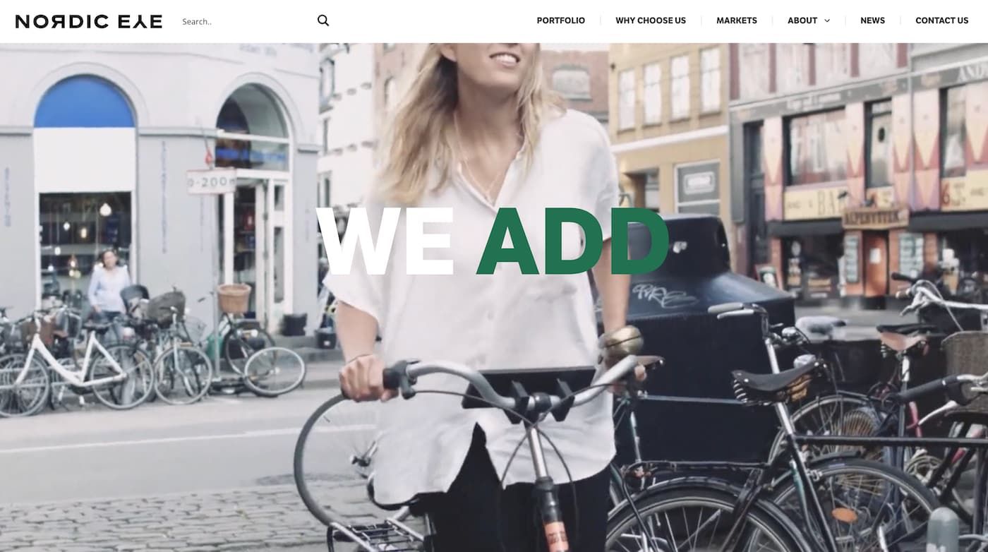
Visitors to the Nordic Eye website are instantly struck by the colorful and vibrant videos that dominate the screen of this consulting website.
Nordic Eye offers a broad suite of services for companies and is one of the best consulting websites for great web design.
Their portfolio page offers a wealth of valuable information backed up with a detailed breakdown of why companies should choose their services.
A clean and approachable modern design runs throughout each page, utilizing white space to help the visual assets pop out of the screen.
It's a great consulting website that caters to up-and-coming entrepreneurs, reflecting how a website is an essential marketing tool for success.
19. Lucidity Design
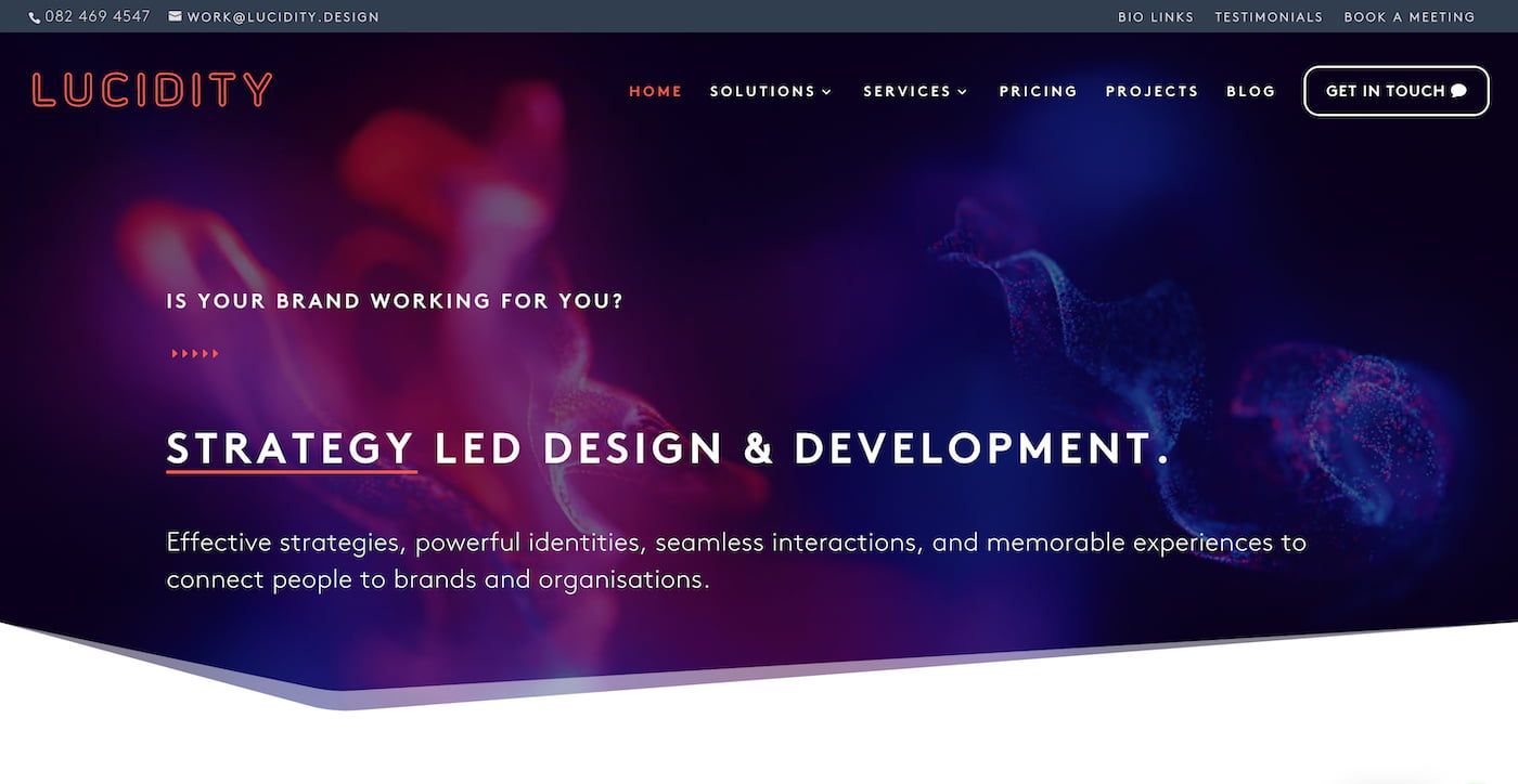
The best consultant websites often face the challenge of imparting lots of relevant information without swamping the reader's attention.
The consulting website for Lucidity Design is a great example of how web design can deliver this information intuitively.
The home page for the Lucidity Design website is headed by an eye-catching image and bold text, leading to the various services offered.
Each of these services, from logo design and branding to creating websites and videos for clients, is then outlined as you scroll down the page.
It's an excellent inspiration for website design and how to use the best freelancer website templates as a starting point.
18. Eleven Lab
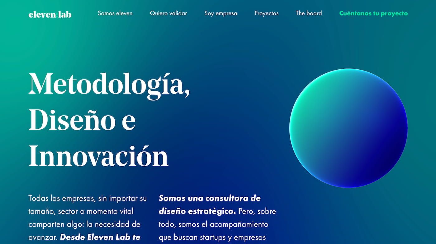
One of the most popular approaches to website design for consulting websites is using dynamic elements throughout the page.
Introducing text and other graphics that scroll onto the screen enhances viewer retention as they engage with new content.
The consulting website for Eleven Lab demonstrates how you can create a user-friendly site that introduces information intuitively.
As you scroll down the home page, information about their services animates onto the screen and helps to break it down into various elements.
Everything is well organized on a single page for an immersive experience, with additional information included on the website's other pages.
17. Harper Grace International
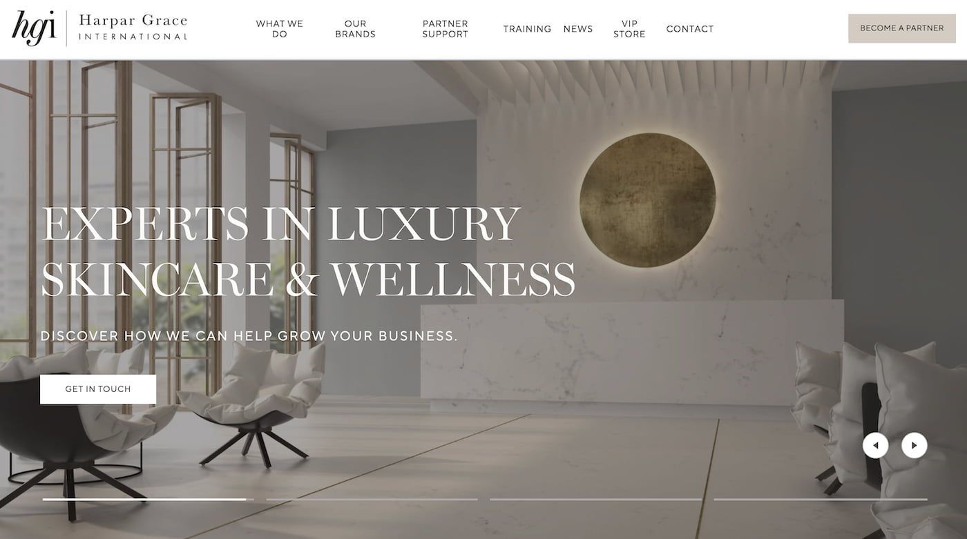
Another example of a strong web design that uses white space to make the assets pop is the Harper Grace International consulting website.
Aside from the image carousel on the home page, the design exemplifies how a minimalist black-and-white approach can be used.
Specializing in healthcare products, it's a wonderful point of reference for anyone starting a makeup line and looking for branding inspiration.
As well as breaking down each product they offer, this easily accessible website design also keeps readers informed of upcoming events.
This helps Harper Grace International build trust in their brand with potential clients while ensuring their site is easy to navigate.
16. Fidus Information Security
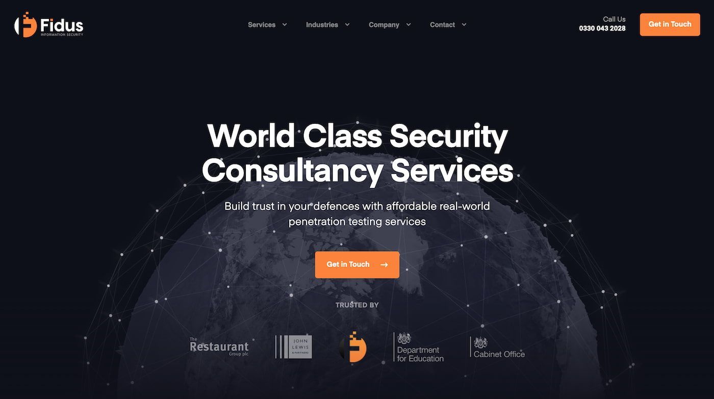
Offering world-class security consultancy services, Fidus Information Security provides another clear example of how less is more.
Blacks, whites, and oranges dominate the color pallet for the Fidus Information Security website design, which helps everything pop out.
Each service they offer is accompanied by a simple but clear icon, with previous client testimonials and media coverage all on the home page.
Contact details are also easily accessible from the bottom of the home page, removing the need for visitors to navigate elsewhere.
With plenty of thought leadership articles to sink your teeth into, it's an exceptionally well-organized consulting website to reference.
15. YMC AG
Setting up digital consulting services is a great way to make money on Upwork, but you might also need a striking website to succeed.
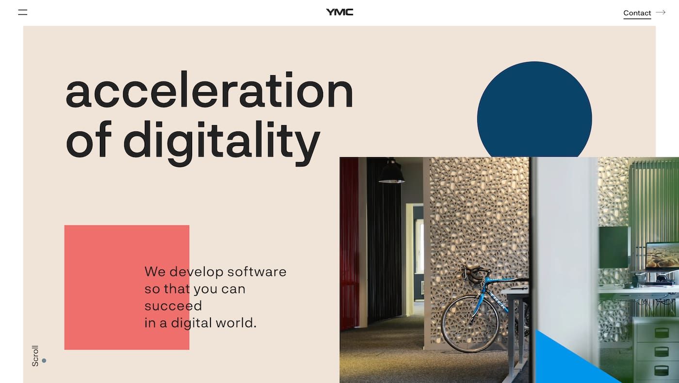
The consulting website for YMC AG showcases how established businesses use a combination of bright colors and text to reach potential clients.
Simple animated colored shapes draw attention to the home page, while the site also uses the hover effect to help visitors interact.
The consulting website breaks down the previous clients they've partnered with and the step-by-step process they use.
Easy to navigate and demonstrating a well-designed awareness of website structure, it's another great reference for your own company.
14. Dierks Company
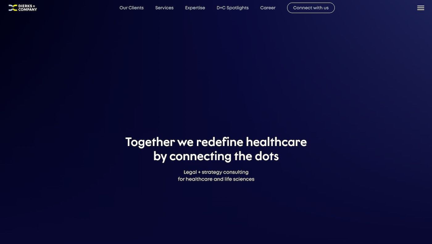
Corporate software developers at the Dierks Company offer a range of development services to help their clients achieve their business goals.
The website for their consulting business draws in potential clients with a combination of on-point information and subtle graphic design.
This is bolstered through photographs dotted throughout the website design, showing their staff at work and adding a personal touch.
Like other consulting websites, the Dierks Company also uses client testimonials with corporate partners to serve as social proof.
It's another fine example of how the best consulting websites use a combination of user-friendly navigation and modern design elements.
13. Edgy Inc
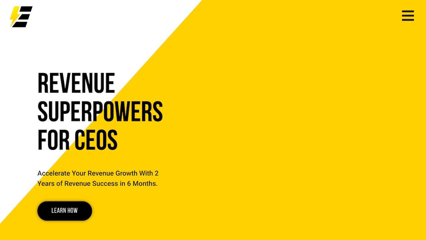
The New Zealand-based consulting business Edgy Inc. uses a yellow and black color scheme throughout the design of each page.
The company, which is oriented toward assisting businesses with revenue growth and sales, uses several persuasion techniques.
This includes praising their clients for their accomplishments and supporting these claims with data points that dominate the home page.
For more detailed insights into these claims, Edgy Inc. offers extensive case studies on a separate page where visitors can find more information.
With additional videos offering testimonials from satisfied clients, it's a powerful consulting website incorporating all media types.
12. Kaber Technologies
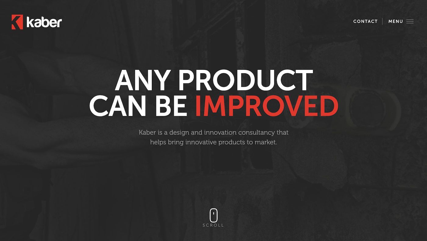
The design and innovation consulting website for Kaber Technologies is another example of using embedded videos to attract potential clients.
It's also a striking example of how simple color schemes can help text dominate the space, using white and red in their text.
This is accentuated by the monochromatic nature of the video clip, with the subtle use of yellows to help the video stand out on the screen.
Scroll down the page, and the visitors are presented with more detailed information on the services engineering designers offer at the company.
While it may seem daunting to create a site like this, the best tools for freelancers can be used to achieve these results on a budget.
11. Goldstein Group
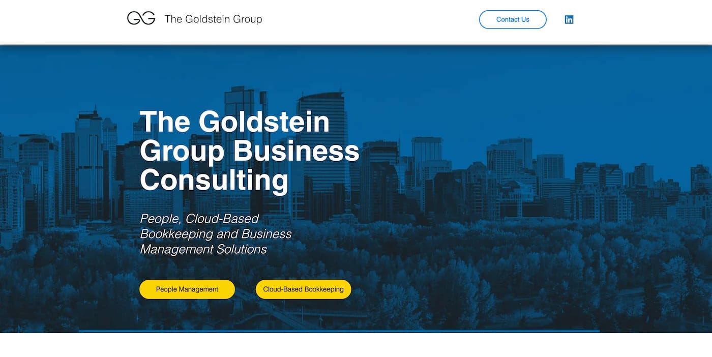
The consultant website for the Goldstein Group hits the reader with a mailing list request before presenting more information on the home page.
Their services in Canada include recruitment and employee retention solutions and other business optimization strategies.
Each distinct service they offer is accompanied by a simple yet effective logo that captures the essence in a single glance.
Beneath this information is the About Us section, which breaks down the previous experience of each team member of the Goldstein Group.
It's a strong example of how the best consulting websites go for a "less is more" approach, keeping things simple and intuitive.
10. Syl
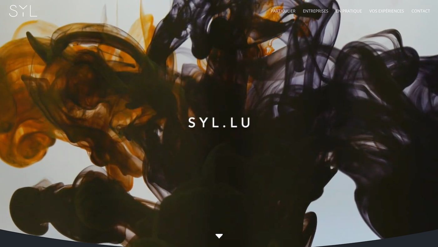
The French professional consulting firm Syl represents the high point of consulting websites in terms of visually appealing presentations.
Full-color videos and animations dominate each page and deliver an eye-catching experience that captures their style.
As with other consulting websites we've covered above, the site uses animated and scrolling text elements to add more dynamism.
A quote from Mark Twain helps to define their core brand and approach to business while bringing a personal touch to the table.
The Syl consultant website will give you many ideas if you're learning how to become a freelancer and working on your online presence.
9. Heron Code
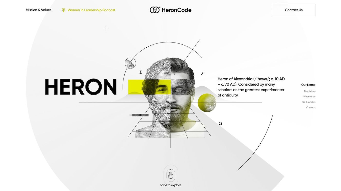
While some consulting websites can overload the viewer on the home page, the consulting website for Heron Code is minimalistic.
Hit the home page, and you're presented with a jet-black screen filled with animated elements over several seconds.
The site's designers have opted to keep the links to other pages as discreet as possible, allowing their graphics to dominate the space.
Additional information about the company's mission and values is easily accessed from the top of the screen in a user-friendly design.
Perhaps most unique to the Heron Code consulting website is the interactive nature of the information presented to potential clients.
Readers are asked to click and scroll on the main image, which brings up additional information and graphics.
It's a bold approach to consulting website design that successfully bucks a few trends for a unique and refreshing user experience.
8. FourFold Consulting
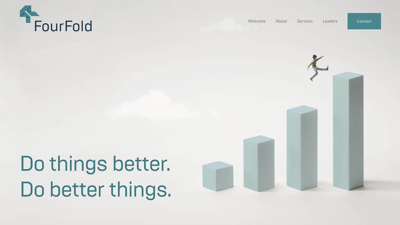
The established consulting firm FourFold Consulting offers a broad selection of leadership services to high-end international clients.
This professionalism is fully reflected in their consulting website design, with a wonderful combination of pastel-colored images against a white background.
Their mission statement is concise, articulating their commitment to sustainable business practices and keen grasp of commercial interests.
FourFold Consulting's services are outlined with precision, and a contact form makes it easy for potential clients to get in touch.
It's a well-designed consulting website that makes it easy to navigate and explore the company's many features.
7. The Green Consulting Group
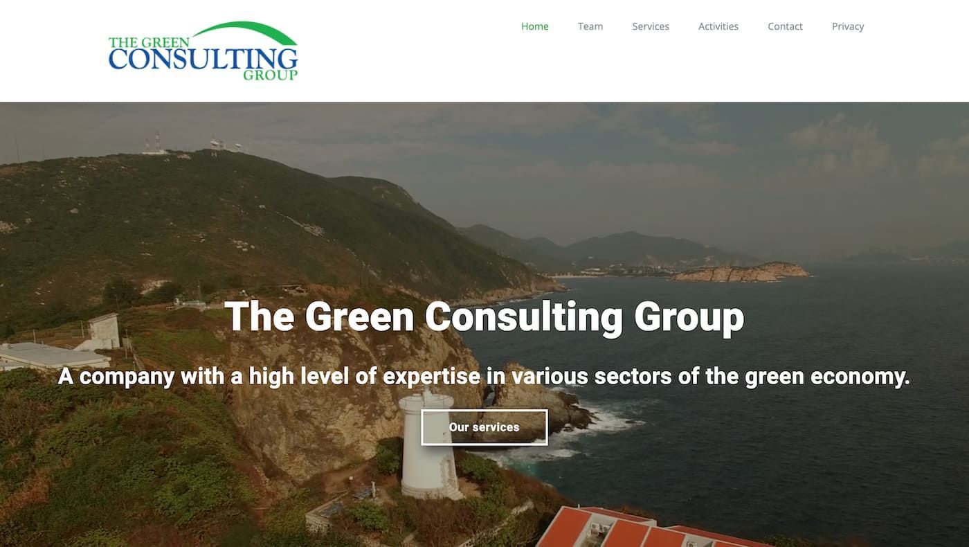
Displaying a great understanding of branding, The Green Consulting Group showcases its dedication to the environment on the home page.
Here, visitors are presented with a stunning video clip background accompanied by white text that captures their essence in a sentence.
Beneath this, The Green Consulting Group website further details its commitment to environmental protection.
The website designers have opted for additional pages covering the Team, Services, and Activities for more detailed information.
As with the best freelance websites, it's a great point of reference for anyone looking to create a professional site for their consulting business.
6. Kesslers London
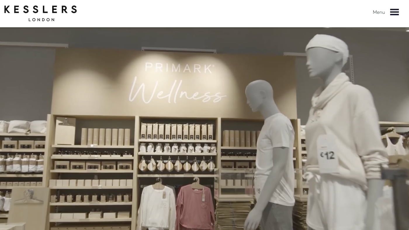
Another fine example of a beauty consulting website is Kesslers London, which has the mission of helping brands develop their identity.
Video footage dominates the experience when loading the site, with impressive use of cinematography and editing on display.
The website articulates the company's core purpose in just a few paragraphs, followed by a selection of icons for their most celebrated partnerships.
There's also an extensive selection of the past projects they've completed successfully, each linked to via a high-quality photograph.
The menu system is discreet, presenting the links once the menu icon has been clicked to avoid cluttering the home page.
Here, you'll find a more comprehensive breakdown of their commitment to sustainability and an introduction to the team members.
If you're considering starting a beauty blog, Kesslers London's consulting website will give you plenty of food for thought as to what to include.
5. BCC Consulting
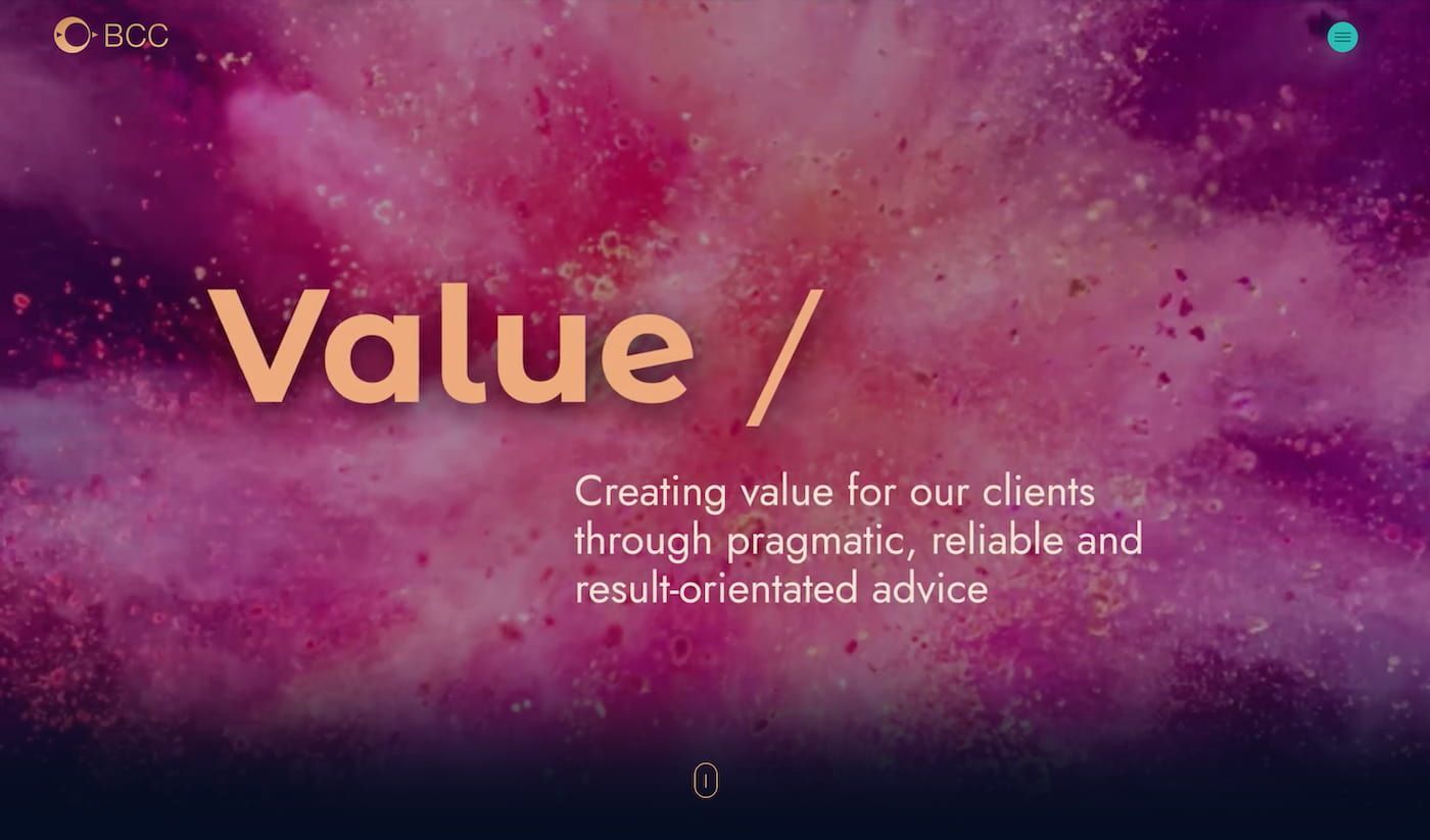
Offering a broad selection of legal services, BCC Consulting also incorporates extensive accounting and business consulting in one package.
Their consulting website marks the high point of web design, capturing visitors' attention with the bright colors of a bird in flight.
This bold and vibrant splash of color is offset by the site's more muted approach to font design and colors as you move down the page.
Just as Syl uses a quote from Mark Twain to add more weight to its claims, BKC Consulting opts for a brief quote from Nelson Mandela.
They outline their commitment to excellence, backing this up with detailed biographies of their dedicated and experienced team.
If you're working on designing a logo for your consulting website, the BLC Consulting website will help you develop your concepts.
4. Hype Finance Technology
While the BLC Consulting website uses the organic imagery of birds in flight, Hype Finance Technology is all about futuristic designs.
The animated introduction to their consulting website draws upon the hexagonal design ethos characteristic of science fiction movies.
Subtle animations that mimic the flow of sparks bring additional visual interest to the table and accentuate the glow around the menus.
There's also a degree of interactivity to the site's design, with an animated cursor that spins as the user navigates the page.
Downloadable information is easy to navigate and access, with additional information presented once the user clicks on the relevant links.
It's an inventive and eye-catching web design that suggests a consulting business that sits on the cutting edge of the industry.
3. Feels Agency
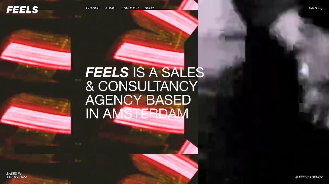
Mainstream consumer brands and high-street stores are immediate points of reference when visiting the Feels Agency consulting website.
As such, it's a handy point of reference for anyone considering using an e-commerce website builder to sell products alongside consulting services.
The presentation has a street culture vibe thanks to the rapidly editing video footage and high saturation of the imagery on display.
The Amsterdam-based sales and consultancy agency keeps the home page to the bare minimum, including a video accompanied by limited text.
For the real substance, visitors can navigate through various pages from the top menu, exploring Brands, Audio, Enquiries, and Shop.
Each of these subpages takes a more traditional approach to web design, with bold blue lettering and black-and-white photos dominating the style.
Feels Agency is a must-see if you've grasped the difference between a solopreneur and an entrepreneur and want a visually striking website.
2. Launchpad
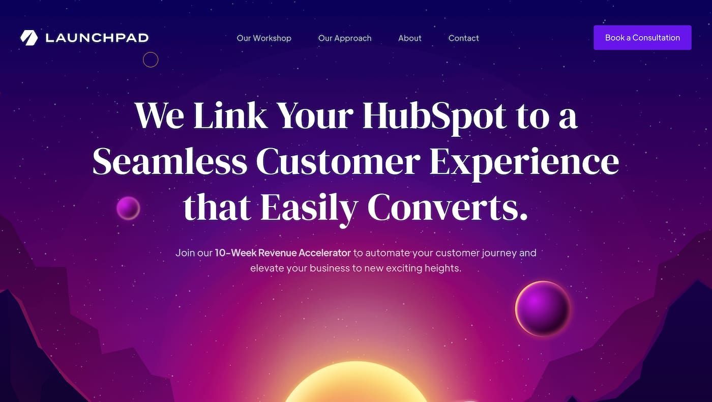
The Hubspot platform is widely used in the business world, and Launchpad offers a range of training and consulting services for this tool.
Subtle animation, interactive elements, and a dominant theme of neon-based colors run through the Launchpad consulting website.
The standard arrow mouse cursor has been replaced with a circle while shooting stars help bring the background to life.
Bold white text stands out on the screen, accentuated by the background, while briefly explaining what the company offers.
More detailed explanations are presented as visitors scroll down, each categorized into core processes, including Discovery, Design, and Implementation.
Testimonials and established partners Launchpad has worked with also confirm their established presence in the business community.
1. Kea Consultants
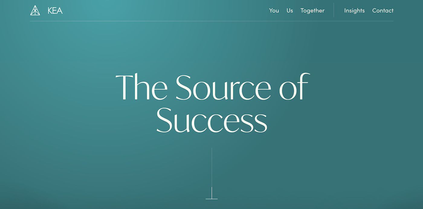
Our final pick for the best consultant websites is Kea Consultants, a boutique search firm aimed squarely at high-end investors.
As such, it presents its credentials professionally and cleanly, with a blue and white color scheme dominating the website.
Tasteful black-and-white photographs of the consultants scroll across the screen before giving way to brief text explaining the company's history.
It includes their core values, business ethos, and approach to dealing with their client's business requirements.
Menu links take a different approach when compared to other consulting websites, with the categories You, Us, Together, and Insights to choose from.
It's a solid example of how a website builder can be used to put together a neat yet visually inventive consulting website that captures attention.
Summary
As the examples we've explored demonstrate, the best consultant websites combine bold and striking designs that complement the information.
You don't need to be an expert in web design to achieve a similar aesthetic, with plenty of online tools for designing and building your website.
It's an essential marketing tool for reaching potential clients by sharing your previous projects and case studies highlighting your services.
CREATE YOUR OWN WEBSITE
As a mom of three, writing became Stefani’s creative outlet, quickly evolving into a part-time side hustle she could do during nap time. After realizing, she had a knack for writing, Stefani pursued it as a profession and now heads up Friday's content. When she's not wordsmithing for Friday, Stefani enjoys playing at the park with her family, snowboarding, and trying new food.
This blog was created proudly with the Friday Website Builder


