25 Powerful Call-to-Action Examples That Convert in 2026
Updated Dec 23, 2025 | Published Dec 9, 2025 | 14 min read
Updated Dec 23, 2025 | Published Dec 9, 2025 | 14 min read

Strong CTAs can transform casual visitors into loyal customers by guiding them toward actions that feel natural, relevant, and genuinely aligned with their goals.
This guide highlights powerful call-to-action examples and breaks down the core principles that make them effective across a wide range of industries.
By understanding these examples, you’ll be better equipped to create clear, compelling CTAs that guide users toward meaningful actions throughout your website.
A call to action (CTA) is a website element embedded on a page that encourages users to take a desired action.
Used by businesses of all types, it’s commonly integrated into marketing campaigns to prompt immediate action and drive sales.
This is achieved through a combination of graphic design and compelling text that utilizes action-oriented language and strong visuals.
Businesses use multiple CTA buttons throughout their websites to build awareness and drive conversions.
A strong call to action serves multiple purposes, guiding users through key steps and improving their overall experience on a site.
In addition to improving conversion rates, a call to action can facilitate site navigation, thereby improving visitor retention.
Creating personalized CTAs for specific goals is a core aspect of a business marketing campaign that converts general interest into sales.
Once the visitor clicks a CTA, the website redirects them to the desired action, whether to purchase a product or subscribe to a newsletter.
Recommended read: Small Business Owner’s Guide.
While CTAs share the same functionality and general intent, different types can be used to reach different target audiences.
Here are some of the commonly used CTA types businesses and organizations embed in their websites to encourage users to act:
Additional CTA types include links to download resources, provide feedback on products or services, and make donations to charities.
Capitalizing on calls to action requires an understanding of how strategic placement can impact their effectiveness.
This placement is primarily dictated by the type of CTA being implemented and how it fits into the overall website design.
Product pages and landing pages are frequently used for CTAs, with the latter often featuring the primary CTA to support business goals.
CTAs can also be used as part of broader ad campaigns, sometimes appearing in video adverts on YouTube and similar platforms.
Additional CTA placement can include at the end of blog posts, in emails and newsletters, or as part of social media promotional campaigns.
Crafting a compelling call to action requires an approach that prioritizes clarity of purpose and clearly states the intended benefit.
This means using concise, motivational language that outlines the reward for clicking through, using no more than five words.
Using the first person is often advisable, while vague phrases that may confuse should be avoided whenever possible.
Compelling CTAs then combine this action-oriented phrase with crisp, clear imagery, contrasting colors, and graphic elements.
When implementing CTA buttons on a site, continuous A/B testing is highly recommended to refine your CTA templates.
The psychology of persuasion runs through the business world, from brainstorming business name ideas to creating compelling call-to-action.
Here’s how CTA language influences the user’s desire to interact with the element and find out more information:
By creating powerful CTAs, businesses can capture the visitor’s attention and encourage them to continue their journey on the site.
Whatever the nature of your business, it’s vital to create CTAs that elevate your website visitors’ experience and journey.
Here are 25 of the best CTA examples from a range of businesses, showcasing how CTA messages can be used effectively.
CTA: Register now/learn more
The CTA from Wealthsimple, an investment services company, is an excellent example of how a primary CTA and a secondary CTA can be combined effectively.
It’s also a great reference point for optimizing CTAs on a mobile website and ensuring they’re clearly displayed to visitors on smartphones.
CTA: How it works
The “How it Works” CTA from Oura Ring is a classic example of how to encourage readers to dive deeper into the brand’s offerings.
The background color matches the page, and the fluid, elegant font selection enhances its appeal to readers.
CTA: Book a demo/Get started free
This impressive CTA for Hot Jar takes a dual approach to engagement, blending a free proposal with the option to book a demo.
Augmenting the text is a crisply animated CTA element that illustrates how their services can help users understand their site’s performance.
CTA: Choose a kit
If you’re looking for inspiration for small business name ideas, Wool & the Gang is an excellent example of engaging and welcoming naming.
The home page has plenty of “Shop Now” CTAs, but it’s the “Choose a Kit” version that demonstrates how graphic design can elevate the format.
CTA: Get yours
With its bold yellow-and-black visuals and product image, LMNT’s “Get Yours” CTA instantly grabs the visitor’s attention.
It’s an inspirational CTA for any website redesign or when researching how color theory and persuasive language intersect.
CTA: View project
Load up the Full Bundle landing page, and a stunning animated background leads through a selection of powerful calls to action.
The “View Project” CTA urges readers to discover more about their work, presented with bold text and integrated into a beautiful website layout.
Further reading: How to get sponsored by brands.
CTA: Discover the collection
Health and beauty brands like Diptyqueparis use their own lingo when appealing to customers, with “Discover the collection” directly relating to seasonal wardrobes.
If you’re considering starting a makeup line, check out the Diptyqueparis website’s structure and CTAs for inspiration.
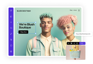
CTA: Shop now
The Takeya “Shop Now” CTA gets straight to the point, eschewing wordy text in favor of colorful product images and the brand’s logo.
Using the catchphrase “illuminate your style” further elevates it, reflecting an advertising approach that favors language that appeals to lifestyle decisions.
CTA: Discover our partners
The professional hotel website matches the calming visual tones of its establishments, blending cool blues with a white background.
The Hilton site includes many CTA examples, including “Discover our Partners,” which encourages action from existing customers who have collected Points.
CTA: Start a group order
A top priority for diners when eating out is placing a group order with minimal fuss, something which Chipotle addresses directly on its website.
The “Start a Group Order” CTA concisely outlines the restrictions and pricing while encouraging site visitors to eat there today.
CTA: Start saving on your bills
Struggling to pay utility bills is a problem many face, and the “Start saving on your bills” CTA on Bill Shark’s website taps into this dilemma.
The CTA is accompanied by clear icons indicating which bills the service can help with: internet, wireless, satellite radio, and Pay TV.
CTA: See what’s on the menu
Playing into the visitor’s desire for healthy, affordable food is the Hello Fresh subscription box CTA, “See what’s on the menu.”
By pairing the link with a carousel of food-related images for all dietary requirements, the CTA’s design appeals to everyone.
The company has recently embraced AI to accelerate recipe production, giving subscribers additional options that match their tastes.
CTA: Shop
This “Shop” CTA from the Nike website is another excellent example of how less is more, with simple yet bold white text on an animated background dominated by red.
The supporting text, which reads “Score big on thousands of styles,” encourages visitors to click through in anticipation of huge savings.
CTA: Download for free
Marketing firm HubSpot offers a comprehensive selection of resources, including an extensive range of CTA templates for marketing and business goals.
Their “Download for free” CTA is elevated with social proof, highlighting that thousands of professionals are already using the resource.
CTA: Shop bestsellers
Another powerful example of how CTAs can use social proof effectively is the “Shop bestsellers” CTA from Hydro Flask.
It’s paired with a vibrant orange-and-pink striped color combination and dark text that pops off the screen for visitors.
CTA: Get Evernote free
As with the HubSpot CTA example, this CTA from the online business Evernote plays on the human desire to get something for nothing.
The CTA incorporates the brand’s visual themes and enhances its impact with an animated display showcasing how the Evernote service works.
CTA: Join OKCupid
Bold images of happy couples instantly capture the attention of visitors when hitting OKCupid’s home page.
Complementing the “Join OKCupid” text is a selection of brand elements, with consistent use of fonts and headers throughout the site.
CTA: Shop discounts
The holiday company VRBO appeals to consumers’ desire for bargains through its “Shop discounts” CTA, located midway down the homepage.
With a stunning photo of a luxurious location as the background, the text is set on a bold blue backdrop to further stand out on the page.
CTA: Start tracking for free/See how it works
The Toggl time tracking software takes the standard approach to color themes adopted by similar brands, with rich purples and vibrant pinks.
These colors are also applied to the “Start tracking for free” CTA, which is paired with another secondary CTA, “See how it works.”
CTA: Get inspired
Inspirational language doesn’t get more direct than Volkswagen’s “Get inspired” CTA, strategically positioned further down the home page.
While it uses more words than other CTAs, the language directly appeals to adventurous lifestyles that reflect the brand’s core messaging.
CTA: Sign up to ride
The spirit of adventure is also a theme explored in Lyft’s “Sign up to ride” CTA, which opens with the headline “The world awaits.”
Lyft has earned praise for supporting its drivers, paying them more, and dismissing the prospect of switching to autonomous cars.
CTA: Help scale my revenue
The B2B marketing company 310 Creative has a clear understanding of its potential clients’ primary objectives.
The CTA “Help scale my revenue” directly appeals to these goals, encouraging them to get in touch and learn how they can help.
CTA: Read case study
A solid foundation for any business website involves user testimonials and case studies that showcase a proven track record of success.
This Asana “Read case study” CTA directs visitors to this information with a simple yet effective use of bold fonts and a testimonial from a reputable source.
Learn more: How to make an e-commerce website.
CTA: Don’t miss out
With its emphasis on handmade arts and crafts, the Etsy website is a thriving platform for all types of creative people.
It’s also a place to pick up regular deals, with the “Don’t miss out” CTA playing on the concept of scarcity to drive engagement and sales.
CTA: Shop gifts
The Apple home page demonstrates how the same CTA can be reused in combination with different phrases and supporting imagery.
While it is dominated by “Learn more” CTAs, this pattern is broken by an eye-catching “Shop gifts” version that appeals to readers’ generosity.
Drawing on the call-to-action examples outlined above lays a solid foundation for writing compelling CTAs that align with your business goals.
Whether launching an innovative AI business idea or refreshing existing web pages, here’s how to write CTAs that deliver results:
By researching direct competitors in your business’s niche, you can continue to create CTAs that persuade visitors to learn more.
While CTAs follow a general structure that can be applied to many situations, there are common mistakes that can inhibit performance.
Some of the design mistakes often made when creating a CTA for a business website include:
You can avoid these potential pitfalls by using a tried-and-tested CTA template and planning your website around your core business priorities.
You don’t have to be a professional copywriter or graphic designer to create a great CTA for a variety of business purposes.
Here are some exceptional writing and designing tools you can use to make your CTA stand out on the page and encourage action:
These tools also have broader applications for creating websites and designing logos, banners, and other page elements.
Read this next: Website hosting cost guide.
Creating an effective call to action can be a challenge, but these answers to FAQs will shed further light on the process:
When starting a CTA, understanding the user’s priorities will help you craft messaging that appeals to their interests.
This can be reflected through the use of strong verbs and other action words, instructing them on what to do next.
Common CTA phrases depend on the purpose; “Shop Now” and “Buy Now” are used for sales and marketing materials.
Other common CTA phrases include “Sign up,” “Learn More,” “Book Now,” and “Subscribe to our Newsletter.”
Shakespeare’s famous expression, “brevity is the soul of wit,” is an excellent way to frame how long a call to action should be.
In general, between 2 and 5 words are optimal, using as many as necessary to provide clarity and inspire further action.
CTAs play a crucial role in guiding visitors, improving conversions, and supporting a wide range of marketing objectives.
By pairing clear, persuasive language with eye-catching design, you can encourage stronger engagement across your site.
Use these call-to-action examples as inspiration to refine your assets and strengthen their impact through ongoing testing and feedback.